Overview
Wolt is a delivery platform that offers food and grocery delivery or pick-up services. The goal of this unsolicited project was to identify any usability issues with the current version of its iOS App and provide UX suggestions for the future iteration.
The key learning point was to embrace the constraints and challenges during the design process in the real world and empathise with the users and also with the designers to understand the motivation and reasoning behind the existing design.
I am responsible for
The entire product design process
My role includes
User research
Market research
Competitor analysis
Information architecture
Wireframeing and prototyping
Usability testing
Whom I work with
Me, myself, and I :)
Duration
3 weeks, June 2021
Disclaimer
I am not affiliated with Wolt in any capacity. This unsolicited redesign project was strictly based on my experience with Wolt’s iOS app as a user and a designer. Since I did not have access to Wolt’s user data nor business model, I did my best to think through every single detail and keep the overall feel of the app intact.
Background
It all began on the day when I made my first order on Wolt's app: I had trouble navigating through it and finding what I wanted. Thinking it might just be a one-time problem for new users, I continued to feel the same in my next orders. Knowing that I was not the only one, I decided to take it as an opportunity to practice my UX skills by exploring areas to improve in Wolt's app.
Discovery: Wolt's Platform Strategy
Wolt expands its business through network effects. First, they partner with the trendiest restaurants to get people excited. Once they get the first engagement, they rely on word of mouth to generate more interest. With increased interest, more restaurants join Wolt, add value to the platform and attract more people, thus creating a virtuous cycle of growth.
Based on my understanding of Wolt's business model, I assumed the primary target action in the app was to create an order, so that they could get the product and Wolt could generate revenue.
To facilitate business growth, other target actions would be to invite friends (to increase customer base) and to redeem codes or earn Wolt credits (customer retention).
Understanding the Problem
I conducted usability testing with 5 Wolt’s users to uncover any pain points that they experienced while using the app. Users were asked to complete a series of tasks as I observed the interactions and took notes of any problems that occurred during the test.

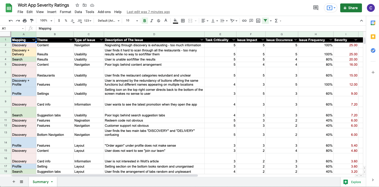
After gathering insights from the interviews, I carried out affinity mapping to group the obstacles that users encountered under common themes and features in the app, and specified which part were the issues found.
Severity Framework
To prioritise the usability issues found, I took a data-driven approach known as the severity framework to prioritise the usability issues found by evaluating their severity ratings, which can be calculated by the following formula:
Task criticality x Impact x Frequency = Severity

Below are the key findings:
• Navigating through the app & information processing share the same severity ratings and are the top two usability issues
• 100% of users found navigation exhausting as the content was overloaded, 80% felt that the content was poorly arranged
• 100% of users had issues with going through the long list of restaurants as they were unable to sort or filter the results
• 60% of users found the restaurant categorisation redundant and unclear, 100% of users found certain features and buttons redundant
• Task criticality: How much impact does it have on the business or the user if the task failed? (1 = low, 5 = critical)
• Impact: How much has it impacted the user trying to accomplish the task? (1 = suggestion, 5 = blocker)
• Frequency (%): Number of occurrences divided by total participants
Wolt's Current Information Architecture
As navigating through the app and information processing are the two main issues, I drew the current information architecture (IA) of Wolt app to analyse its structure and how different pieces of information were organised.
My objective is to reduce the cognitive effort required for users to achieve their goals. I highlighted areas in the IA that contributed to users' pain points and created a list of questions on how to create design solutions for them.
Zoom in or open in full screen for better experience
Ideation: My Revised Information Architecture & Suggestions Made
I created a revised information architecture to highlight the app’s key features and improve the overall organisation and navigation throughout the app. I highlighted areas where I have made changes with the same colours and numbers corresponding to the current IA for easy comparison.
Zoom in or open in full screen for better experience
Paper Prototyping

Redesigning the Experience for "Discovery"
Suggestion #1: Content Rearrangement
Zoom in or open in full screen for better experience
Information overload discouraged users from taking the target action as they do not have a logical flow to follow, resulting in a poor (or even no) decision-making process.
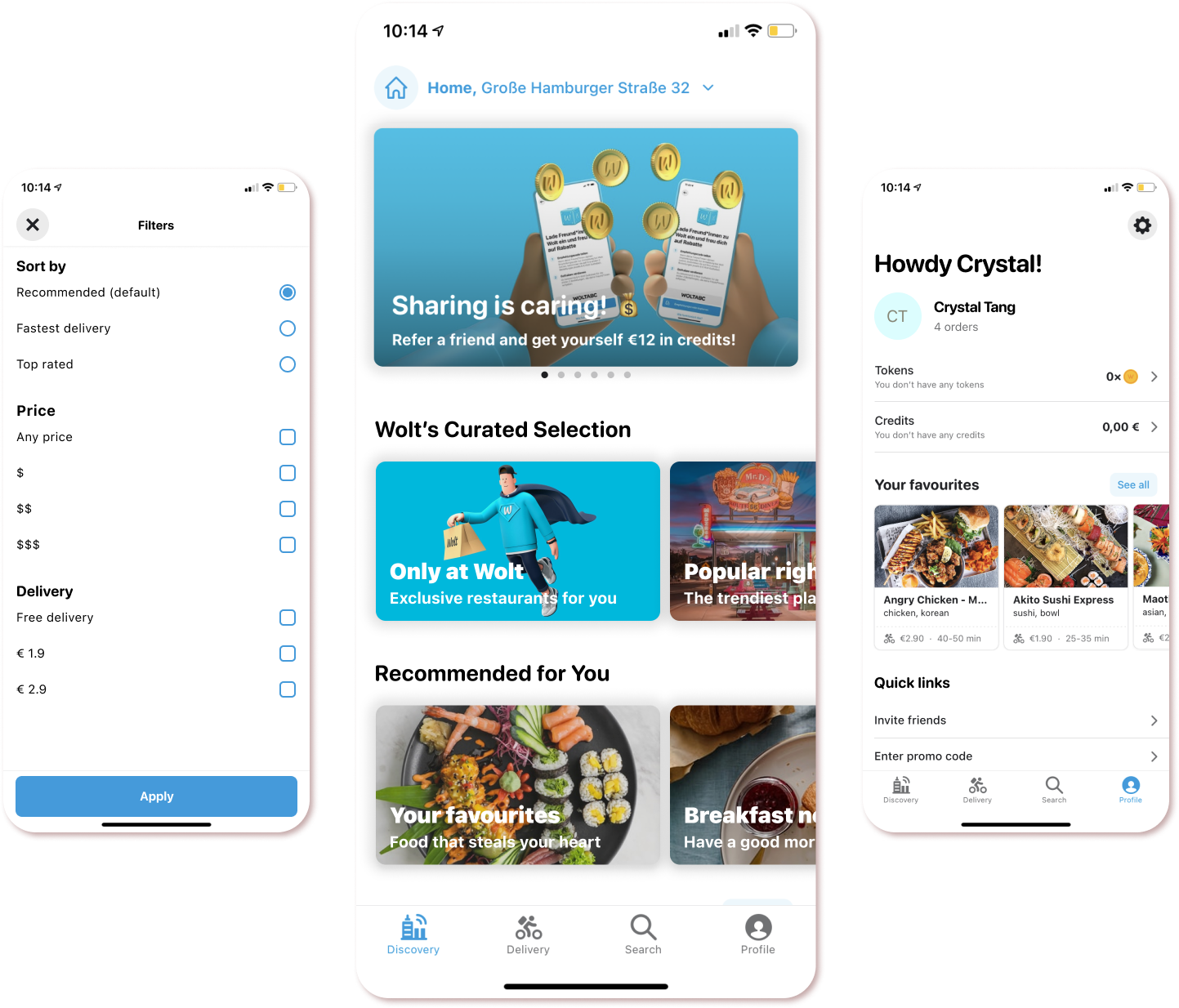
To provide a simpler and clearer user flow, I performed the following content rearrangement:
• Reduced clutter by removing non-order-related content
• Replaced content in carousel cards with Wolt's latest promotions only
• Further separated the restaurants' categories into two groups: Wolt’s Curated Selection & Recommended for you
• Created individual cards for each category with a title and description
Suggestion #2: Adding Filters Under Each Category
Zoom in or open in full screen for better experience
Redesigning the Experience for "Delivery"
Suggestion #1: Adding Filters in Delivery Section
Zoom in or open in full screen for better experience
All restaurants and stores within the delivery area of the user’s address were shown without being categorised. Users could not sort nor filter the results, which was one of the top frustration they had.
To improve user experience, save time and reduce the cognitive effort required to get to a specific result, I:
• Added the number of results shown
• Added the “filter” button which combines sorting and filtering functions
• Filtering criteria were based on the existing information shown on the restaurant card
Less time spent on searching for relevant content = More time spent on browsing = Higher chance of ordering
Redesigning the Experience for "Search"
Suggestion #1: Content Rearrangement
Zoom in or open in full screen for better experience
Users found the current suggestion tabs confusing and the search results are hard to scan through.
To provide a clearer layout, I:
• Added "Recent searches"
• Added the title "Popular searches” above the suggestion tabs to be more clear
• Removed "My recent order" as it was not related to the search function and could be found in Discover
• Added filters in search results
Redesigning the Experience for "Profile"
Zoom in or open in full screen for better experience
Suggestion #1: Reduced Redundancy
The redundancy of features and buttons with different names left users confused and difficult to find what they need.
To simplify the user flow and make the section more organised, I:
• Combined “Earn Wolt Credits” & “Credits and Tokens” and renamed it into “invite friends”
• Removed "Order again" as "Order history" already existed
• Removed settings at the bottom and moved all setting-related content to a separate screen under the setting icon
Suggestion #2: Content Rearrangement Based on Previous Changes
As I rearranged the previous three sections of the app to be related to making orders only, the remaining content and features were moved to the Profile section. I further separated the Profile section into three parts:
• The first part is about user’s interactions with Wolt regarding orders (e.g. tokens & credits, favourite restaurants)
• I named the second part "Help & Support", which is about getting in touch with Wolt whether it is related to orders or not
• The third part is settings, I further categorised it into account settings and privacy-related settings
Conclusion
What started as a personal complaint about the app turned into an endeavour to recreate the user experience and a valuable lesson in designing for corporates. I understand how easy it is to create an unsolicited redesign of an existing app as I am shielded from all the constraints and challenges faced by the designers and developers who created the original one, whereas in the real world there are financial, technical, and business constraints that could impact the app design.
For example, I assumed one of the reasons why users cannot filter the results is because Wolt would like to make users read through the list to increase the exposure of the partnered restaurants. And if the filter feature is not available in the initial app structure, the developer has to create new API features to implement it and pass the QA test, which will cost money and take time to develop. In the end, what comes off as a simple feature involves complex decisions and requires a strong reason to justify the act of adding it to the app.
Learnings
1. Stay humble, there is always something to learn
Wolt's design team has most probably already thought of the suggested solutions I made and there might be a reason why they did not go that way. Empathising with them helps to broaden one's perspective as there is always something to learn from every decision.
2. Dealing with constraints and challenges is part of the design process in the real world
Designing in the real world is about being creative under various constraints. It is important to acknowledge that dealing with constraints and challenges is part of the job and being able to compromise for a common goal is a strength.
3. Make the redesign purposeful
Establish clear objectives before starting a redesign project, then think about how the redesign can be useful for the company, be it improved user experience, increase brand awareness, or promote business. Only dive into redesigning when there are valid reasons.
4. Consider the brand identity
When working on a redesign project, it is important to consider the brand identity of the company, learn about its key values, and be consistent with it. For example, Wolt has its unique brand voice, when recreating the app content, it is important to align with its tone of voice and communication style to stay on-brand when communicating with the users.


